Your Scanner Says You’re Compliant. Your Data Tables Say Otherwise.
Automated tools catch about a third of WCAG issues. The other two-thirds is where the lawsuits actually live.
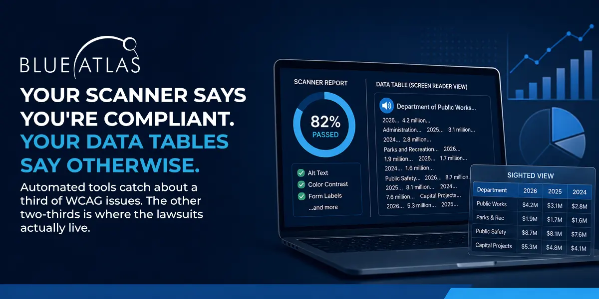
A sighted person opens a city budget page and sees a clean, well-designed table. Department names down the left. Fiscal years across the top. Dollar amounts filling the cells. The information is there.
A screen reader user opens the same page and gets a string of numbers and labels with no organizing structure. The dollar amounts arrive in an order that does not match the question the user came to answer. The table is technically present. Functionally, it is not.
That gap, between what a sighted user sees and what a screen reader user actually experiences, is the part of accessibility that automated scanners cannot evaluate. It is also the part where ADA website lawsuits most often start.
What Scanners Actually Catch
Automated WCAG scanners catch about 25 to 40 percent of accessibility issues. According to a 2026 comparison of axe, WAVE, and Pa11y by Crosscheck, the three dominant tools are useful for code-level findings the machine can verify objectively: missing alt text, low color contrast, missing form labels, empty buttons. None of them are capable of evaluating the criteria that depend on human judgment.
“Only 30 to 40 percent of WCAG specifications and criterion are cut and dried like one and zero,” said Nate Stockard, President at Blue Atlas Marketing. “The other 60 to 75 percent either require a human to make an assessment, or they are somewhat opinionated. Is the language understandable? Does the alt text actually describe the picture? An automated scanner cannot determine that.”
The gap matters more than the headline. Most accessibility scanners present a percentage-based passing score that gives organizations the impression of a complete diagnostic. Some scoring systems define passing as a 67 or higher out of 100, which by construction acknowledges that nearly a third of issues will fail.
“They have already admitted that almost a third of their issues are a problem, but that’s okay, they let it go,” Nate Stockard said. “When you get the demand letter, give me a call.”
What a Screen Reader Actually Hears
The clearest place to see the audit gap is in how screen readers handle data tables. Tables are nearly universal on the kinds of websites Blue Atlas serves: municipal budget pages, county fee schedules, school district board calendars, college course catalogs, healthcare lab results, e-commerce product comparisons.
When a data table is marked up correctly, a screen reader announces each cell along with the relevant row and column headers. “Department of Public Works, fiscal year 2024, $4.2 million” is meaningful. When a data table is marked up incorrectly, the same screen reader announces the cells in an order that may have no semantic relationship to the original layout.
“It might read all the way down the first column, and it is all labels,” Stockard said. “Then you go back through the data, and the question becomes, which data point goes with which label. If it is not grouped and labeled properly, it is like I gave you a table with 20 cells and we randomly picked them. Cell one, cell twenty, cell five, cell sixteen. That is what it feels like with a screen reader.”
The result is the user gives up.
“If you are using a screen reader with an inaccessible table, you might as well skip it and just hope for the best after that,” Stockard said. “The table is not going to make any kind of sense.”
None of this shows up on a scanner report. The HTML is technically present. The cells contain content. The page passes a scan. The user cannot read it.
Why Charts Are the Worst Offenders
Charts and data visualizations compound the problem. The point of a visualization is to communicate information through visual encoding, which by definition assumes the user can see the encoding.
The most common failure is over-reliance on color. Red for negative, green for positive, blue for one category, orange for another. Designers and marketing teams use color to differentiate because color is the easiest visual variable to work with. WCAG fails any chart that depends on color alone to convey meaning, because the chart is unreadable for users with color blindness and meaningless for users who cannot see at all.
“If you have two bars on a chart and you don’t describe that one is bad and one is good, you are hoping they are going to understand red is bad and green is good,” Nate Stockard said. “You have made an assumption based on something they may not see.”
Vispero, the company that makes JAWS, publishes its own guidance on data-visualization accessibility, recommending three components together: an accessible name, an underlying structured data alternative, and keyboard operability for any interactive chart. The A11Y Collective’s accessible charts checklist adds the rule that contrast minimums apply to chart elements just as they do to text. The pattern across both sources is consistent: a chart should never be the only path to the information it visualizes.
“The simplest accessible chart is the one paired with the data behind it,” Stockard said. “Make the table accessible. Then describe in the alt text what the visualization is actually showing. If two bars are very high and the rest are tiny, say that in plain words. Translate it for the people who cannot see it.”
Why These Pages Get Cited in Lawsuits
The reason data tables and charts dominate accessibility complaints is the reason they dominate the websites themselves. They contain the information the user actually came for.
Per Seyfarth Shaw’s 2025 federal court tally, 3,117 federal ADA web accessibility lawsuits were filed in 2025, a 27 percent increase over 2024. When state court filings are counted, the total exceeds 5,000 cases. Plaintiff firms are not citing pages where the breadcrumb navigation is broken. They are citing pages where the user could not access the fee, the schedule, the calendar, or the dashboard they needed to actually transact with the organization.
“That is where the lawsuit starts,” Stockard said. “A good attorney can go to court and say my client cannot pay the fee because they cannot see what the fee is. The court has already ruled in our favor. Here is your lawsuit. And that is really hard to defend because you skipped it.”
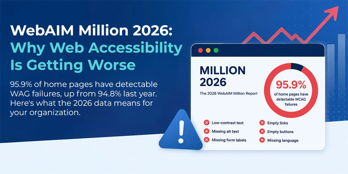
According to the WebAIM Million 2026 report, 95.9 percent of home pages on the web have detectable WCAG failures, with an average of 56.1 errors per page. The detectable failures are the ones scanners catch. The undetected ones, the structured-content failures that humans evaluate, are not in that count.
What an Audit Actually Delivers
A scan is a starting point. A real audit involves a human auditor navigating the site with assistive technology (JAWS, NVDA, VoiceOver) and evaluating the criteria the scanner cannot:
- Whether alt text actually describes the image
- Whether data tables read in the order their content requires
- Whether charts have meaningful text alternatives, not just present labels
- Whether language is understandable to non-expert users
- Whether the keyboard tab order matches the visual reading order
- Whether ARIA labels announce the right thing in context
This is the part of accessibility work that scoring systems cannot capture and overlay scripts cannot fix. It is also where Blue Atlas audits spend most of their time, evaluating data-table markup against the W3C Web Accessibility Initiative’s tables tutorial and confirming that what looks correct in code actually behaves correctly with assistive technology.
“You can do every box right on a scanner report and still fail an accessibility test, because the scanner cannot tell whether what you did was useful,” Nate Stockard said. “A human goes through and says, this was done, but it was not done right, because a real user cannot use this. That is the only test that matters.”
The Misconception Worth Correcting
Of every reason organizations defer their audit, the most expensive is the one rooted in a scanner’s pass score.
“Ninety-five percent gets you an A,” Nate Stockard said. “Ninety-five percent doesn’t get you out of a lawsuit if the other 5 percent are the pages your users actually need. You can have 95 percent of your site fine. If the one main user flow is broken, you are getting sued. And you should be.”
The scanner does not check whether residents can pay their water bill. The scanner does not check whether students can read their course catalog. The scanner does not check whether patients can read their lab results. The scanner checks code. A real audit checks whether the code does what the code was supposed to do.
Where Does Your Website Stand?
A Blue Atlas audit runs the same scanners a plaintiff firm runs, plus the assistive-technology testing the scanners cannot do. We test data tables on actual screen readers, evaluate chart accessibility against WCAG 2.1 Level AA, and produce a remediation plan that doubles as a defense if a demand letter ever arrives.