Part 3: Web Accessibility Principles – Understandable

Welcome to our third guide on WCAG (Web Content Accessibility Guidelines) criteria, what they mean, and how you can achieve them! Let’s start with a quick summary of the WCAG 2.1 before diving in.
The WCAG 2.1 is a global standard for website accessibility, which allows individuals with disabilities to use websites successfully. That’s particularly important for businesses that want to make sure everyone can buy from them online, or organizations that want to avoid fines and lawsuits that can occur if their websites don’t reach a certain level of accessibility. If you have seen warnings about ADA (Americans with Disabilities Act) compliance or similar requirements for online content, it means following the WCAG for websites and other online tools, including accessible PDFs.
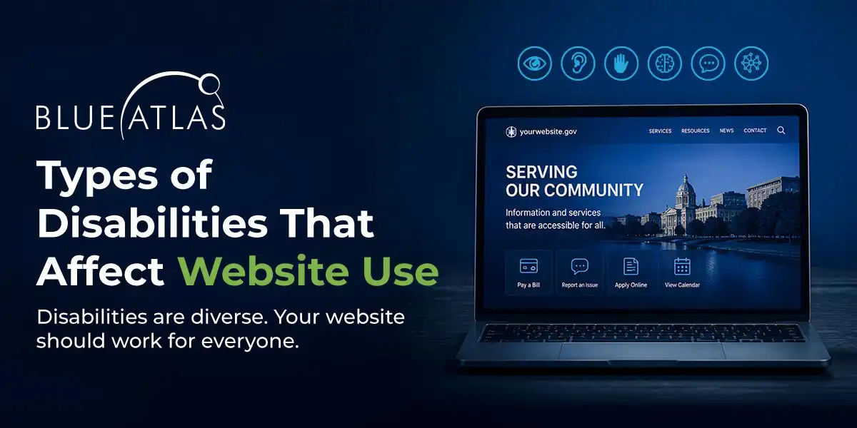
The WCAG focuses on four primary pillars – Perceivable, Operable, Understandable (this article), and Robust. In this guide, we’re taking a close look at the Understandable pillar, and what it requires of websites.
What Does “Understandable” Mean?
While the Perceivable pillar is all about the human senses like sight and hearing, the Understandable pillar is more focused on the mind. Users should be able to understand the web content that they read or hear (for those users using screen readers), without getting confused or losing track of what they’re trying to do.
The pillar means that a website should be careful about the terms it uses and the wording of any instructions or explanations. It should also focus on a clear, logical design so that users are never confused about what to do. Calls to actions, menus, buttons, and other interactive elements should always make sense. When users fill out information on a website, web forms should be clearly labeled and explained – and so on.
Since it’s not always easy to tell how Understandable a website is at a glance, let’s look at the specific “success criteria” that the WCAG 2.1 uses to ensure that understandability isn’t an issue.
WCAG’s Understandable Guidelines
Readable
Web design isn’t just about navigation and graphics – it’s also about how words are used. This is important with basic news and blogs, but even more important when a website is describing its services, teaching users how to do something, or providing product information. Websites should always be easy to understand for a wide variety of users. This not only helps those with certain disabilities that can make it difficult to read or focus, but is also beneficial for those who may not have English as a first language. Important points here include:
- Default language on the site should have the ability to be “programmatically determined” which means it’s compatible with screen readers and browsers or apps that can translate it into a different language automatically. This usually comes down to proper coding and tagging decisions throughout the site. There are important exceptions for certain unavoidable issues, like technical industry terms, jargon, and words that are difficult or impossible to translate. But that brings us to another important point…
- There should be a mechanism to identify unusual words when necessary. This could be industry terms that may not be familiar to some users, idioms that won’t really translate (it’s a good idea to simply avoid idioms in most web content), and other kinds of jargon. If web content is a little complex, then websites should include a glossary or clear definition of terms that users can look up to learn more. The WCAG itself is actually very good at this, linking its unusual phrases directly to glossary entries to explain them.
- Acronyms and abbreviations should be explained. Websites need to spell it all out the first time to avoid confusion. Use acronyms or abbreviations too many times, and many users can become discouraged trying to pick through the content and find out what it means.
Predictable
Predictability is all about effective website design that’s easy to understand and does what’s expected. Overall, the internet has become much more “predictable” than in its early days. Many sites use popular web templates that act in familiar ways to users, and the growing necessity of mobile optimization killed off many of the weirder website elements that could confuse people.
However, predictability can still be an issue with hastily constructed websites, or older sites that have fallen behind the times and don’t function like users expect them to. Important criteria to consider include:
- The website focus should be clear but not confusing. A “focus” is what webpage action a mouse pointer or keyboard selection is currently on, such as a button, link, or form input. This should be very clear, marked by perhaps changing color, text decoration, and/or outlines – but it shouldn’t change context. For instance, a focused link should not open until user activates that link.
- Navigation should be consistent throughout the website. The menu should always be in the same spot, and the webpages listed on it should always be in the same order. If a website includes links to content further down the page, these links should be presented in a consistent and orderly way. This is another criterion that modern web design has largely solved, but it can crop up sometimes when users switch to different section of a site, like from a blog page to a product page.
- Terms for webpage functions should remain the same across the website. For example, if the search box in the upper right corner of the home page is labeled “Search,” then it needs to be in that same location and say “Search” every time. If users go to a different part of the website and it is suddenly blank, or says “Find” instead, this can be confusing.
Input Assistance
Inputs refer anything that users may type into a website, like filling web forms, requesting a quote, or putting in billing information. A number of disabilities make typing slow or difficult, and if individuals make a mistake, it can be very frustrating for them to fix it. To avoid people getting frustrated, or even leaving the website, websites should have certain kinds of input assistance: This not only help individuals with these disabilities but makes filling out forms easier for all users.
- When a website requires inputs, it should also include both instructions for those inputs and labels for each section. When filling out contact information, for example, users should always know which field is asking for their phone number, and which is asking for their address – it should be properly labeled – and this doesn’t just mean by placeholder text which disappears when the input is focused on.
- If the website can automatically detect input errors, it needs to make the error very clear to the user with text describing what the error is. That could be something like a note saying, “Account numbers don’t match,” and highlighting the account number fields so that users know what to correct.
- Some Websites offer legal documents that must be agreed to, financial transactions that must be confirmed, tests that need to be submitted, etc. Forms like these need automatic error detection, or the ability to reverse a submission, or a final confirmation screen to review all information before submission. The WCAG says websites should pick at least one of these, but they all offer value to users.
Quick Note About Compliance Levels
Our guides serve as helpful explanations of the WCAG, so you don’t have to dig into the gritty details. But if you do, you will find that the WCAG’s criteria are labeled with levels of compliance, A, AA, & AAA. That leads to a lot of questions, so here’s what organizations should know.
Level A is the baseline of accessibility, steps that all websites should take to make the site easier to use in all kinds of circumstances. Meeting Level A is always a good idea. Level AA criteria are more advanced steps that websites can take to address more specific accessibility issues. Businesses that want to meet ADA compliance should make sure they follow these success criteria. Then there is Level AAA, which is primarily reserved for government websites that need to meet the highest level of accessibility. This level is recommended for those working with government entities as well as those specifically catering to users who are more likely to have specific disabilities.
Finding Professional Help for Your Website Accessibility
Website accessibility can sometimes grow complicated, especially for businesses that haven’t considered it before or haven’t updated their websites in some time. It’s not always easy to find capacity in-house to make accessibility changes, or an agency that has direct experience with the WCAG. Fortunately, Blue Atlas Marketing can help. Contact us to ask questions about your website, get a quote on potential updates, and discuss what sort of web design changes may be necessary in your particular case. We’re happy to help with website accessibility and many other improvements you may want to make.