Don’t Buy Into These 5 “Trends” For Website Development
In the web development world, trends usually come, then go. And stay away for ever… Technology changes and people do new things. Then, web developers see the award winners or top brands use the new style, functionality, etc. and suggest using it too. How many websites look like Apple’s website? Just because your developer visits the site 5 times a day to buy some other “cool” Apple product, doesn’t mean you should let them steer you into building a site that looks like Apple.
However, the following trends seem to re-surface from time to time, and they really should stay away!
1) Stock Images

When building a website, so many companies default to using stock images. I can spot a stock image 10 pages away (well maybe not 10, but as soon as I land on the page), and so can many web users! I know we are looking at the web and websites all day, but your prospects / visitors have to know there is not a stunning handsome young guy standing on a white background working at your company (see image to the right!). In fact, the image displayed to the right is one image I have seen overused by networking groups, chambers, and B2B websites. Just because he sticks his hand out doesn’t make your visitor trust you any more!
Why are stock images a problem?
The biggest reason is the lack of authenticity. Companies struggle more and more to build credibility and trust with prospects and customers, so why contribute no value with a stock image. You are saying several things:
- We are too broke to take good photos of our real people
- We don’t have any real people, so the stock guy is the best we can do
- You don’t care about your brand to develop your own imagery
Although these may sound harsh, they really are the way people can interpret your stock images. Maybe you will get lucky, and they won’t notice. However, you are spending several thousand dollars building a website that works… Why not spend a couple hundred on a photo shoot?
By the way, there are many good photographers that won’t charge $10,000 to do a photo shoot. Yes, you may have to pay $2,500 for a day rate, but make good use of it. Take 1,000s of pictures and be prepared for the shoot. Also, make sure they don’t retain copyright after you pay them. No need to license a picture of your own product!
2) Flash Intros (Splash Pages Altogether)
I would think the days of people wanting flash intros would have passed by now. Instead, we get requests almost as much as we don’t get requests for a flash intro page or splash page. Why do people feel that a user wants to watch a “cute” flash movie that ends up showing your logo? Haven’t you heard you should capture the visitor’s attention in 10 seconds or so (lots of opinions on what this number really is, but flash intros don’t help no matter what it is)? And splash pages just create an extra click!
Why are flash intros or splash pages a problem?
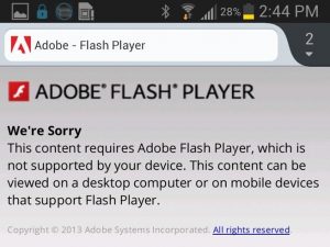
The image to the left shows you what a user may see when they try to load your flash intro. A plugin will not be “available.” They will try to download, and for some weird reason, it isn’t available on their device. Actually, the reason is Apple, and later, Android decided against supporting flash on devices. Was it a stab at Adobe, maybe, but when just about everyone has an Apple or Android (sorry if you have a Blackberry. Get mad at your company), you should avoid a known issue!
Splash pages that cause a user to click just to get in is just a waste of a click. Let the user find what they want within 2-3 clicks, and don’t waste one on a splash page. Also, if you have a page that basically is a portal to two different sections of your website, you may want to consider two different websites.
3) Apple-Like Icons / Images
I have to explain why this is a bad idea, but I think it is obvious. Every time an Apple user starts talking about a website, they bring up, “Make It Look Like Apple.” I want to respond with, “Great, we haven’t create a project for Apple in a while.” After a blank stare, I would explain that we are branding your company, not Apple. Why would we make it look like their brand? Yes, they are very well known, but so is Coca-Cola. Why are we mimicking their website?
What is the problem with mimicking Apple’s website/brand?
Apple is Apple. They have done a great job of branding and preserving their image. Because of that, people want to be like them. No matter who you are, you should try to create your own brand identity. You probably have collateral that doesn’t look like Apple’s (especially since you never really see many brochures from them anyway), and I bet your business card has your logo, font, and color scheme on it. Stick with your own thing.
If you have a competent designer and creative team, they will be able to create your own style. Showing them Apple as a site you like because of the white space and the modern fonts will help the creative understand what you want, but please don’t copy them! Too many web designers are already doing that!
Clever But Unclear Navigation
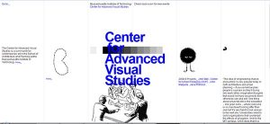
We love to be creative! In fact, Travis, our creative director, is very artistic and can draw/sketch/paint just about anything. However, just because we are creative doesn’t mean we need to get too “creative” with website navigation. Look at the website for MIT’s Center for Advanced Visual Studies.
What do you click? I finally found the main navigation in the top left corner where the Go To words appeared (very small, I might add). Hover, and here come a few small text links. Took me a minute, especially after being distracted by useless animations. This is MIT? They really didn’t have an intelligent person think this through?
Why is clever but unclear navigation a problem?
Just as I described, I couldn’t find the navigation. I would REALLY need to dig on this site in order to stay. If I am just surfing around doing research, this site would lose out on any more than 3 seconds of my time!
Even though you or the creative team might think it is really cool to do something unconventional with navigation, please don’t! There are ways to increase the graphic appeal of menus, drop-down menus (heck, put a video in a drop-down menu), and general navigation. However, you really need to understand what you are trying to accomplish with your website. Want to drive leads, get email sign ups, or any other similar conversion? Make it easy for the user to get around and find what they want!
Separate Mobile Site
No need for an image here, because any mobile site can look good, no matter how you get there. In fact, mobile sites typically are built with simple design for faster loading. We just don’t think you need to create more work for yourself or web team by creating two interfaces. In some cases, there may be no alternative. In most situations, you probably need a new website anyway, so take advantage of some new trends that are good. Go responsive.
What is responsive? Responsive Design takes one website and makes it move and resize to fit the user’s display. This is important for tablet and phone users. The same users that would have gone to your separate m.mywebsite.com site before your new design!
What is the problem with a separate mobile site?
People hate using websites that don’t give them the info they want quickly. Then they have to find the Full Site link at the bottom to go to your desktop version, which is now a pain to view on a mobile site. Make it easy and use the same content on both interfaces (why responsive is a good idea!).
Also, the person updating the website will almost always forget to update the mobile site from time to time, so it is now incorrect or contains out-dated information.
Finally, you could have analytics and tracking issues with two interfaces. Two websites may not communicate very well and content may not translate very well from one to the other.
Don’t be one of the examples the web an use for what not to do in web design/development. Let bad trends die, take advantage of new options!
These are just 5 trends to avoid. What other design or development decisions have you seen fail?