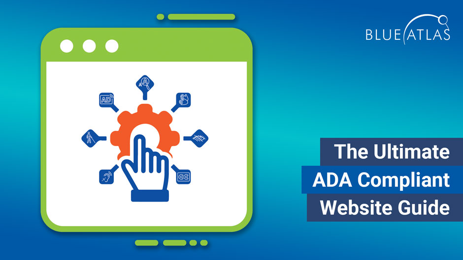
5 Things That Your Website SHOULDN’T Have in 2021

5 things websites shouldn't have

5 Things That Your Website SHOULDN’T Have in 2021

When a business first sets up its own website, there’s an especially important piece of advice that it should hear: The internet doesn’t sit still. Online sites are constantly evolving, experimenting, and adopting new designs, tools, or practices. What online visitors expect from websites also changes over time, and new demands can make old websites look poorer over time.

Brands that forget this lesson can sometimes be surprised how much can change over just a few years. When several years pass without a website changing at all, certain elements or choices may be hitting the wrong note for visitors. Marketing agencies like Blue Atlas can help you plan an update and make necessary changes to your site, but let’s take time to look at what webpages should NOT be doing in 2021.

Content Stretching from One Side of the Page to the Other

Take a look at successful modern websites, and you’ll probably notice a lot of blank or white space. That’s because it’s effective – blank space helps people focus on the elements that do exist and keeps visitors attentive on the message. Content, especially text, that spreads from one side of the webpage to the other with no breaks will quickly confuse and overwhelm. Innovate use of menus and blank space can help fix these problems, and sometimes just a few formatting reworks can make a big difference. This also helps your content become more scannable, so that visitors short on time can quickly find what they are looking for without needing to examine every bit of content.

Remember, this doesn’t apply only to text. We’ve seen many websites make similar mistakes by cramming in images, buttons, and colors from one end of a webpage to another. Minimalism is currently popular for good reason – online users are simply tired of the clutter. Every piece of content on your webpage needs room to breathe!

Pop-Up Ads That Block the Whole Screen

There’s nothing wrong with pop-ads that are done the right way, but there are other ways to get ad real estate on your website than large pop-ups that cover all the rest of the content. Think about the last time you visited a new site and a pop-up immediately blocked everything you were trying to view – not a fun experience, and not a feeling you want associated with your brand. It’s no surprise that these types of ads are one of the big causes of a higher bounce rate where people simply leave instead of trying to navigate the site. Avoid disruptive ads so this will never be an issue.

Auto-Play Videos with Sound

As with pop-ads, there’s nothing inherently disruptive about auto-play videos on your landing pages, but they are easy to misuse – especially if the autoplay includes audio, which is generally always a mistake. People browse websites while listening to music and podcasts, or while enjoying a bit of quiet – a burst of sound is the quickest way to lose them. Landing page videos can be an excellent bit of content, but make them play on-demand, or at least have autoplay videos that are properly captioned and muted when people first visit your site.

Hard-to-See Links

Both inbound and outbound links on your website should be very clear to all visitors no matter what device they are using. Underlined, bolded, in a different – whatever it takes to make it clear that this is a useful link that visitors can select. Links should also be set to change appearance or color after they have been used to avoid confusion. Remember, link use is very important for performance monitoring, SEO improvements, and general website health. If your site didn’t include link formatting like this or links are a little too difficult to notice, you could be losing significant website value.

Low Quality Images

Fuzzy or blurry images could make anyone rethink your website, so while images are important to include, they need to be high quality. Images that have too high a resolution can create loading or support problems, but this is relatively rare. We suggest mandating a minimum resolution for all images on your site or reviewing each image to make sure it looks appropriate. There are a number of schools of thought on this – an old rule suggested that images should be 72 pixels per inch on the screen, although these days that can often look low resolution as well, especially on large desktops. A healthy size for primary images is around 1500 x 1000 pixels, but this is something you can go over with your designer and staff to get into specifics.

On a related note, stock photos are fine to use in a variety of circumstances (on blog posts, for example), but websites should stay away from using stock photos on their landing pages and similar important users: Online uses can quickly recognize stock photos, and unique brand images are always preferred.

Confusing, Hard-to-Read Fonts

Websites should have fonts that are consistent across the site, have good contrast with the background for visibility, and have a legible design and size that’s easy to read on any device. Some websites make the mistake of trying a more stylized or special font to stand out – that usually just makes the pages harder to read. Discuss font options with your designer (Google has a whole guide about this as well) and stick with readability over style.

Is It time to redesign your website?

If some of these website design choices feel a little too familiar, it may be time to consider a broad update to your site. Blue Atlas can provide the planning and web development services that you need while making sure that your site stays faithful to your brand, logo, and other key business elements. If you aren’t sure where to begin, start thinking about what website designs you appreciate most when online, and your own website could benefit from adopting similar options.

Start planning your website redesign with free resources offered in our redesign planning kit!

Get Access to the Ultimate Website Redesign Planning Kit

Related Posts